
Uncategorized
OURS Pivot: Rebrand, New Product, New Site
contents
When I first joined OURS in February 2023, the online platform was a hub for educational content around premarital counseling. OURS paired async sessions and two live sessions with a guide, who was a trained social worker. The branding was fun, fresh, and intentionally unserious to disarm the stigma around couples therapy. But to be clear, Ours wasn’t ‘real therapy’ by definition – it was coaching and content for one point in time. It was mostly async educational content, with a sprinkle of live human connection through the guides.
Fast forward a couple of months and OURS pivoted from an educational platform to a ‘real therapy’ hub.
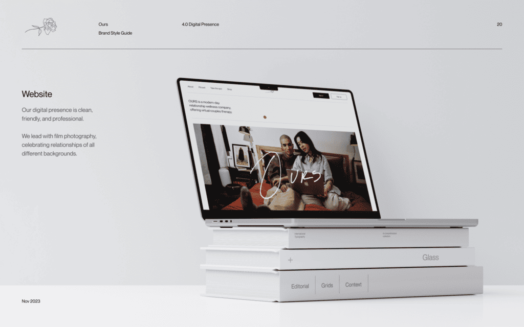
What did this mean for design? A completely new product from scratch — think client portal, therapist portal, admin portal, and all the flows in between — plus potentially a new brand…which would also mean a new website and updated photoshoot. All to be designed in 4 months. (On the product AND brand side)
The process was far from linear but with the design system I inherited, we were not built up for success in terms of accessibility and responsiveness. So, the updated design system was something I worked on in tandem, with designing the logged-in experience. Since many of the components had to be redone, the brand naturally evolved.
01 Rebrand
Once the product was in a workable spot, we did a sprint on what the future brand could be. While the old branding was awesome, and it truly was, it didn’t quite encapsulate where Jess & Adam wanted to take the company. They wanted OURS to emulate professionalism as we were now HIPAA-compliant (thanks to Tyler) and were aspiring to compete with the big names in the therapy business.
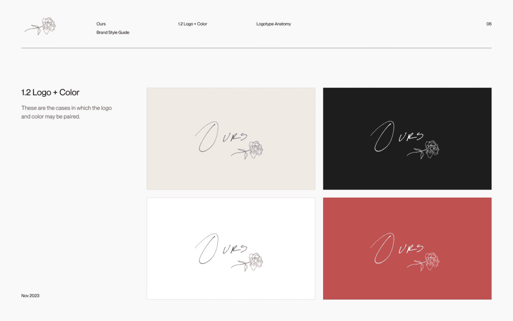
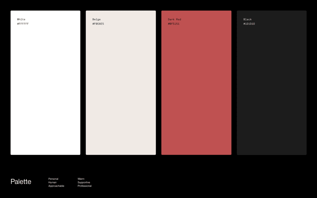
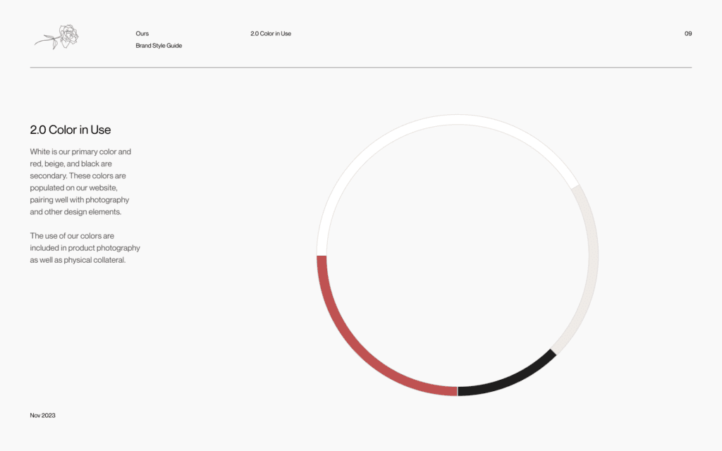
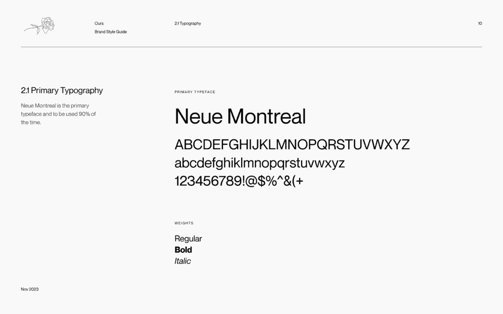
I did my best to take us through an extremely expedited brand sprint. We maintained the font Neue Montreal and the beige color, but changed everything else.
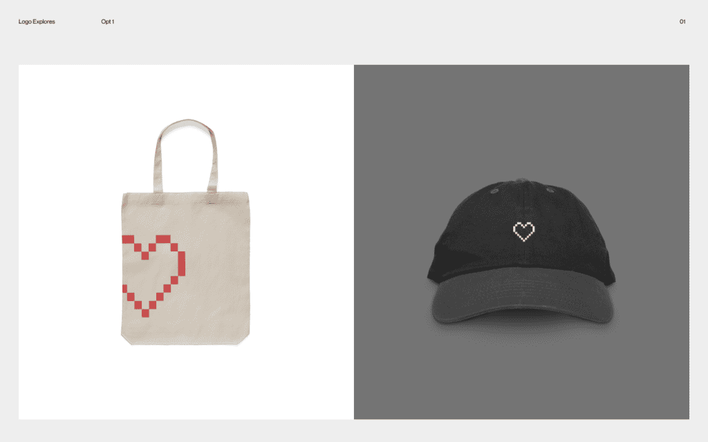
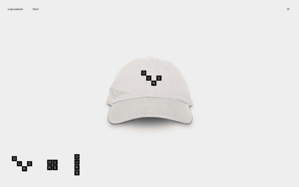
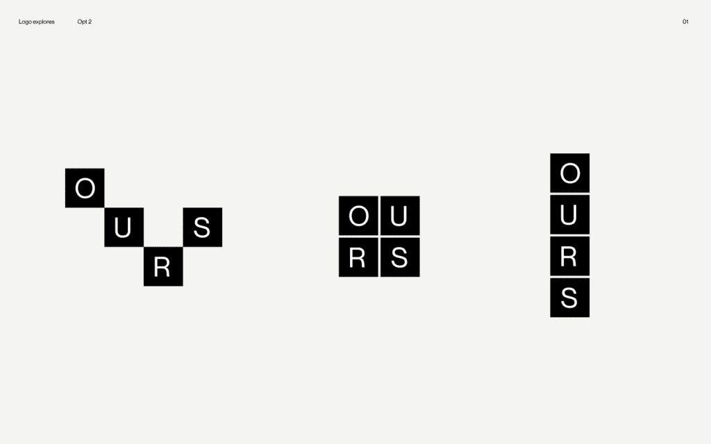
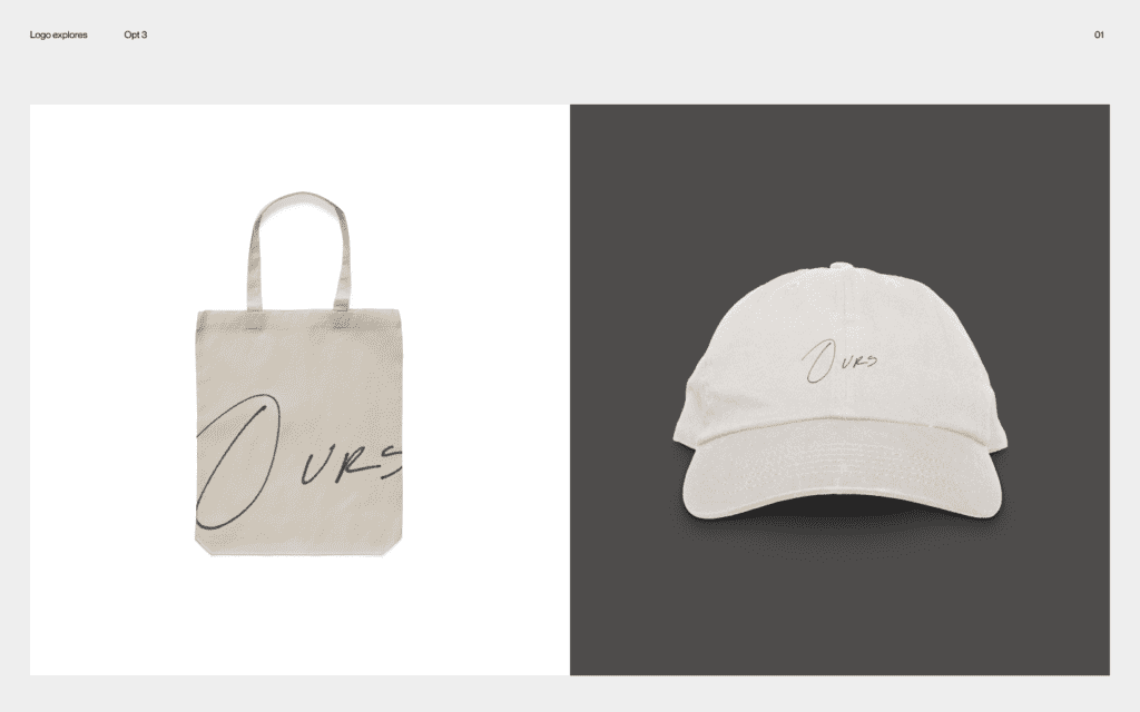
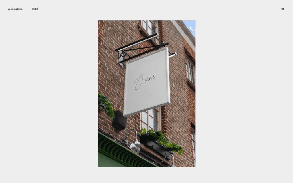
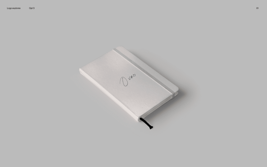
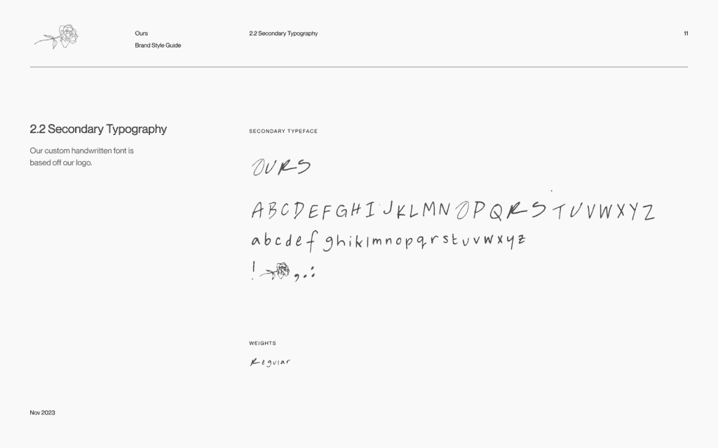
In the ideation phase, I did a number of logo exploration and brought my friend and artist Cori Maas in to help ideate on one of the directions. She brought the Ours logo to life with an animated illustration of the hand-drawn name and rose. I loved the idea of incorporating a rose into the brand because I could see how the stages of a rose could reflect a mini OURS session: discussing the rose (area a couple is flourishing in), bud (area a couple is improving in) and thorn (where the couple needs help). In a perfect world, we would tie that into the product experience – and we would be able to create an RBT in app for couples to document their progress.
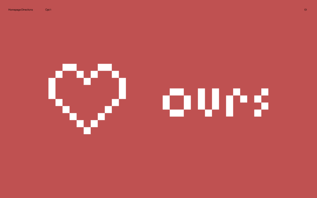
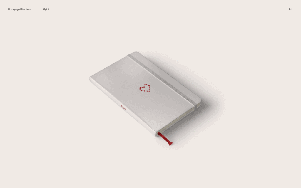
Concept 01: pixelated heart – represented digital couples therapy
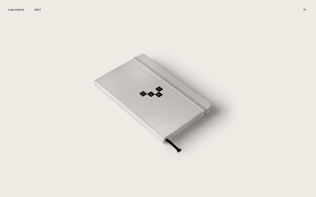
Concept 02: Building blocks – represented the idea of there are many ways to build your relationship, no one size fits all approach works
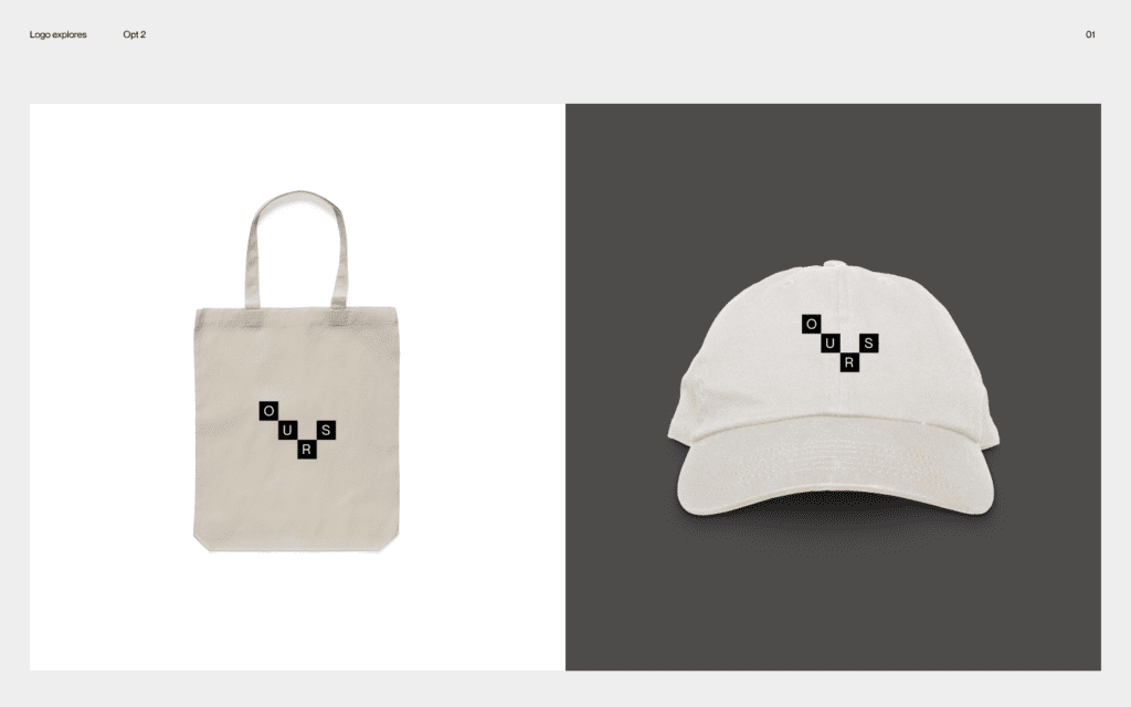
Concept 03: Hand drawn – is a nod to love letters shared between a couple as well as the act of journaling, commonly used in reflection
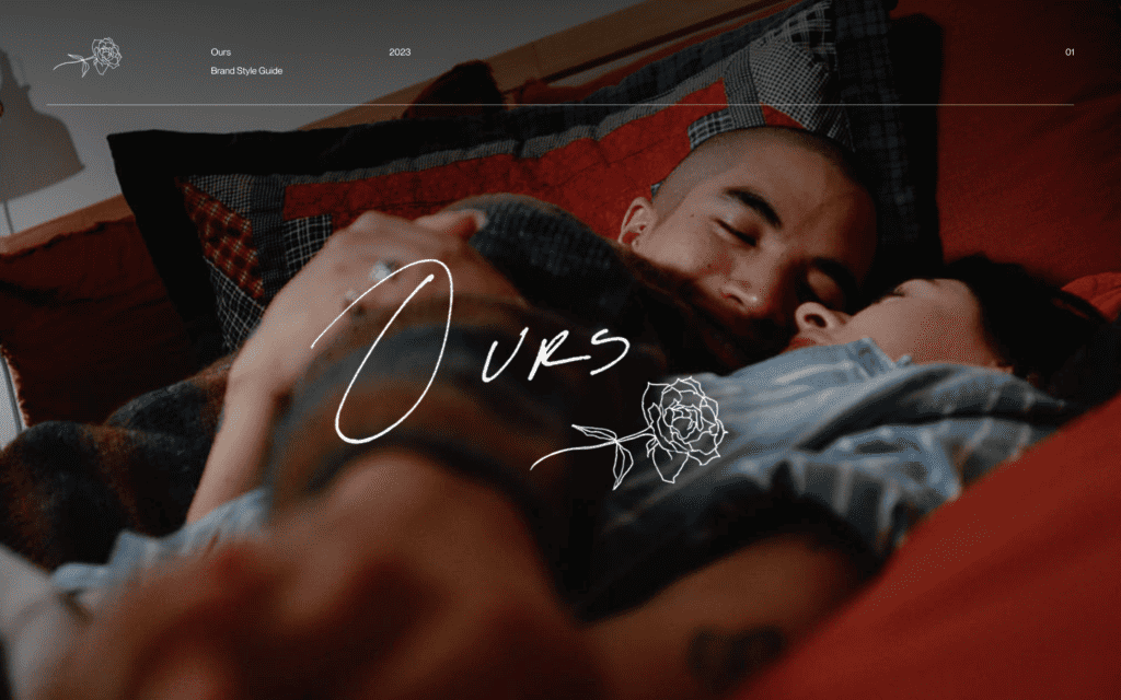
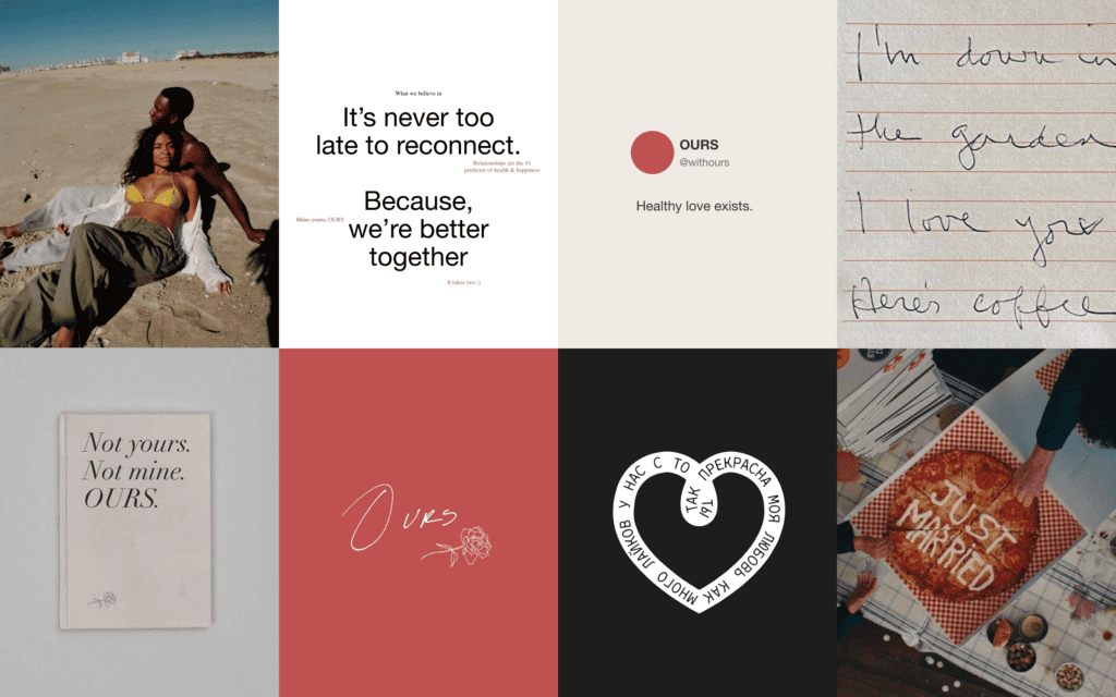
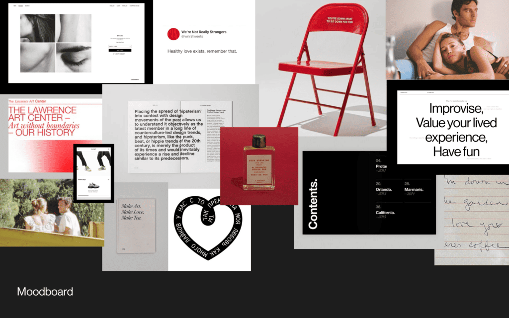
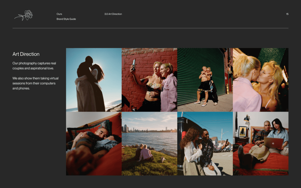
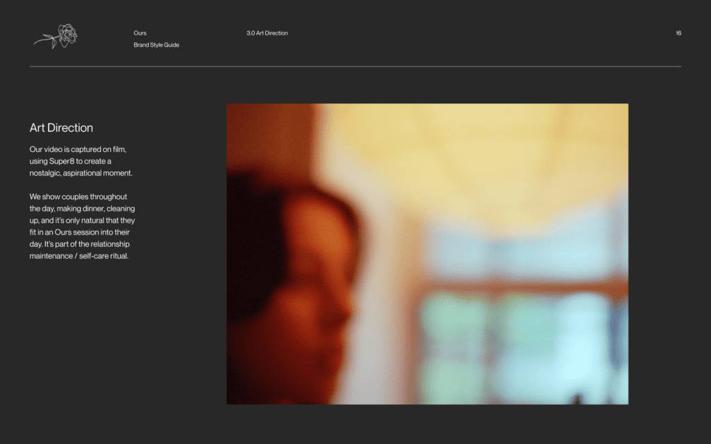
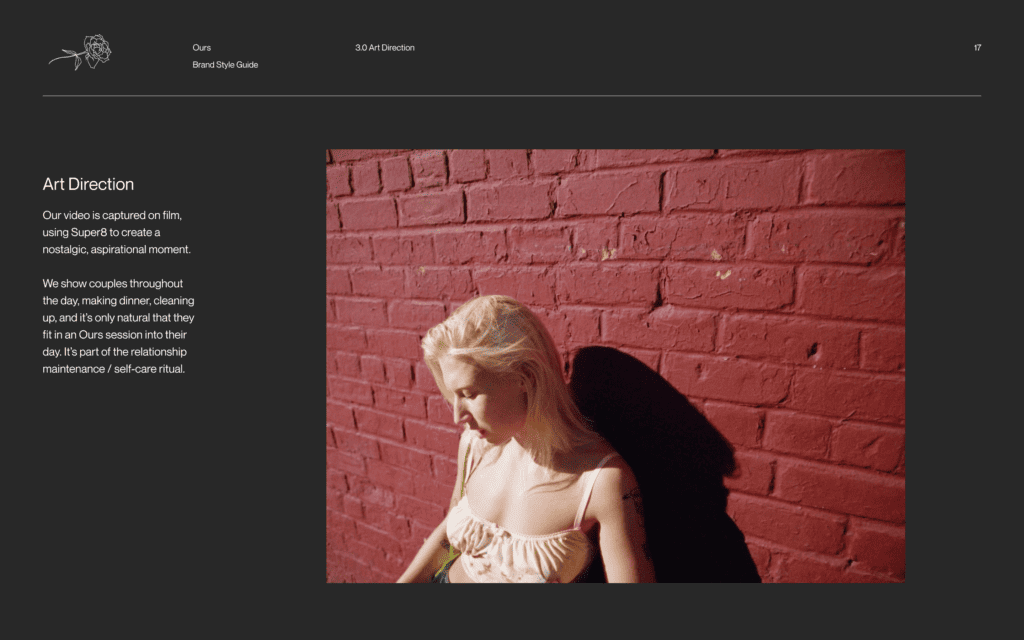
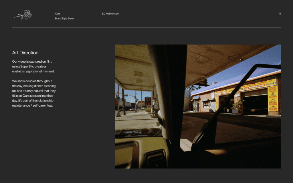
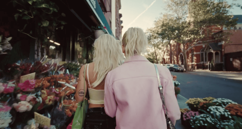
The one big gaping hole in this was art direction. In the ideation phases, I gathered videos from friends in relationships to piece together a cut. I really wanted to show real, authentic couples to step away from the staged in-studio photography that proliferates the internet.
See here, oof… this is what you see when you Google Images ‘couples therapy’:

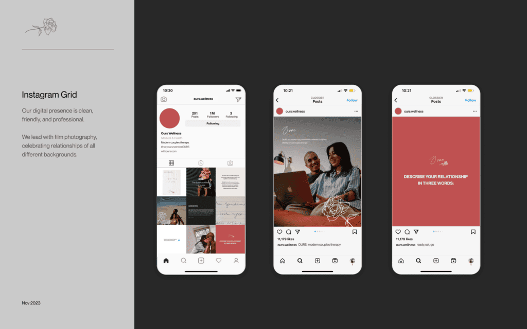
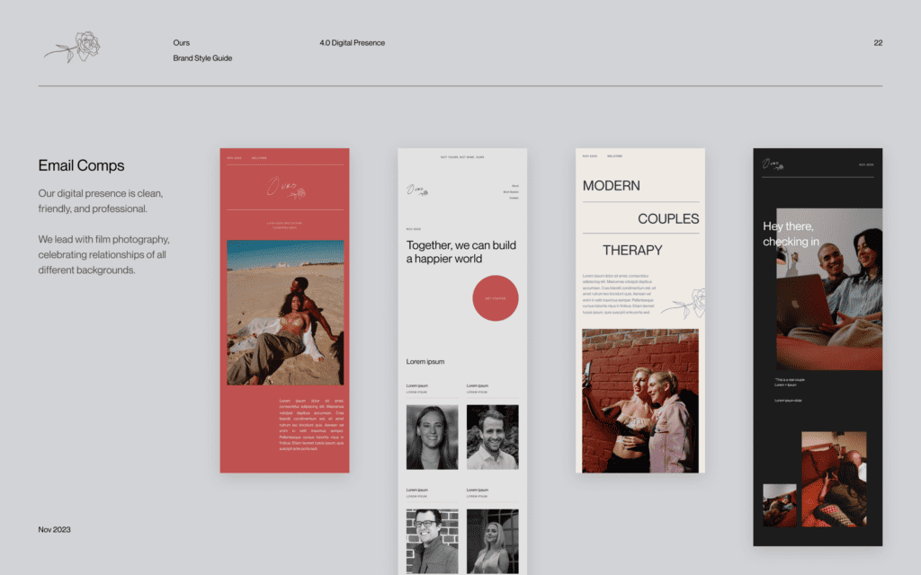
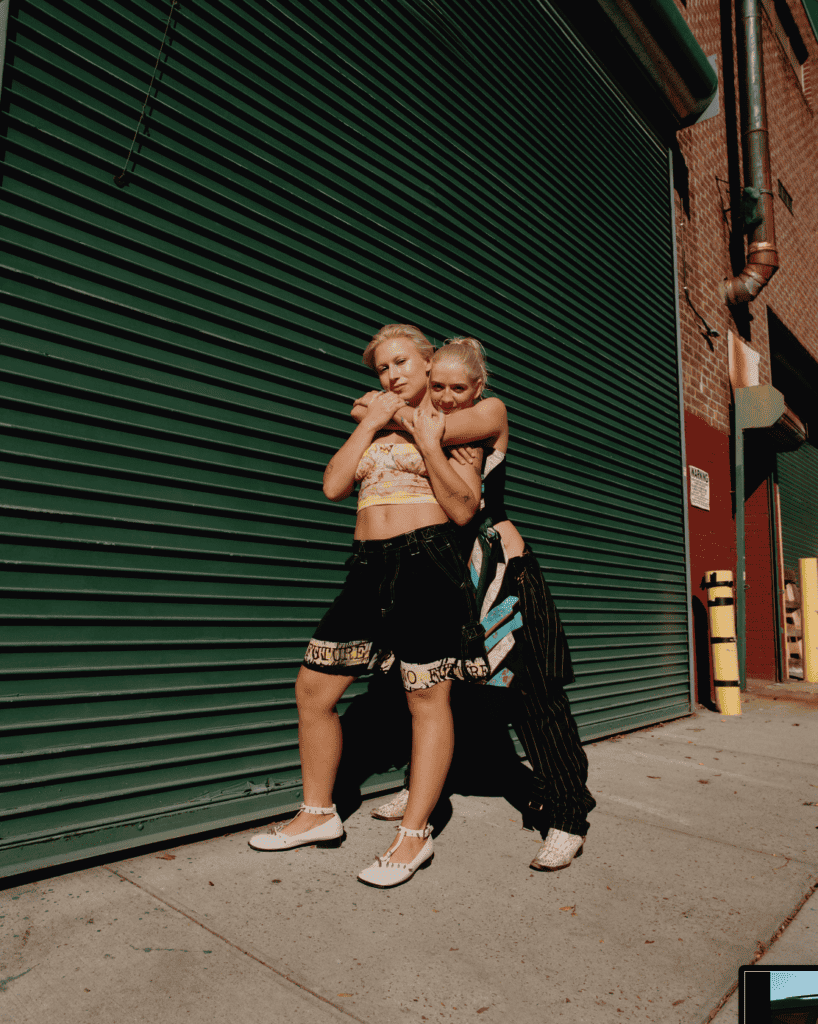
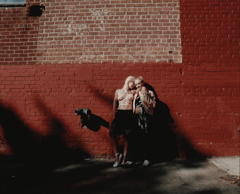
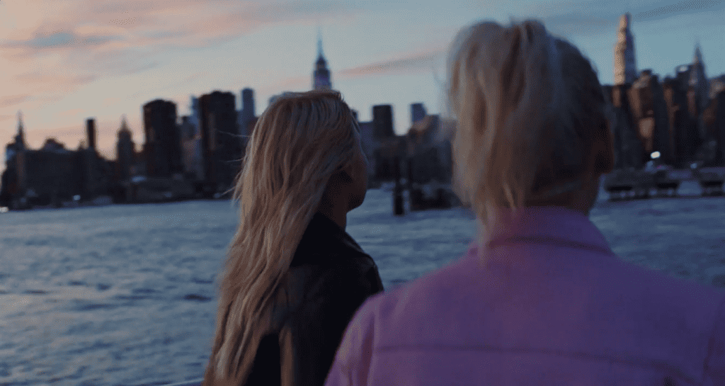
Previously, the brand relied upon illustration and color to stand out but we needed assets to make the new evolution feel human. I loved the nostalgic, intimate feel of film — it felt like something you’d find in a bedroom drawer. I created an interview questionnaire (inspired by 0.4 times), to bring real life couples into the Ours experience. The stories shared on P(ROSE) brought a human feel into the brand and also gave couples the chance to reflect on their relationship in a structured way, similar to a mini session.
While I was in search for a photography partner, I stumbled across Vivian Kim’s Sunny Days on Vimeo. It was perfect. It felt nostalgic, aspirational, and real. We would later do a shoot with her in New York with three real-life couples… The team crushed it.
As for the red, this color actually was an error color for a previous design system but it was a perfect balance of striking without being too alarming. #BF5151
Our WIP Brand Guidelines
02 Product
The product was designed in tandem, as we developed the brand. There were three dashboards to design: Client (the couple), Therapist, and Admin view.

More articles

Relationship wellness
7 mins
Replace your weekly date with a Rose Bud Thorn

Ask a therapist
2 mins
What should we talk about on a roadtrip?
Ask a therapist
1 min
How can I tell the difference between immaturity and maturity?
Ask a therapist
2 mins
How can I get the most out of premarital counseling?
Relationship wellness
7 mins
Going to couples therapy made me start a business
Science meets dating
5 mins
82% of premarital couples go on dates at least once a month.
Science meets dating
5 mins
Household management is the #1 disagreement for premarital couples.

Ask a therapist
4 mins